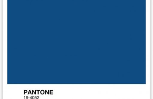
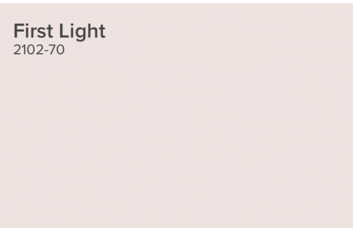
Every year, various design-related institutions create their color of the year. This offers us an opportunity to be more creative and embrace something new, or not. However, this year’s colors offered by Pantone and Benjamin Moore have left us wanting.
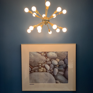
While we love the idea of a blue wall (see one of our recent projects below) and always enjoy adding a light fresh neutral to any color palette, when these colors were announced, we felt they lacked a bit of depth. Therefore, we have decided it’s time to offer our own color of the year.
CMFTO’s Color of the Year for 2020 is: Light Pewter.
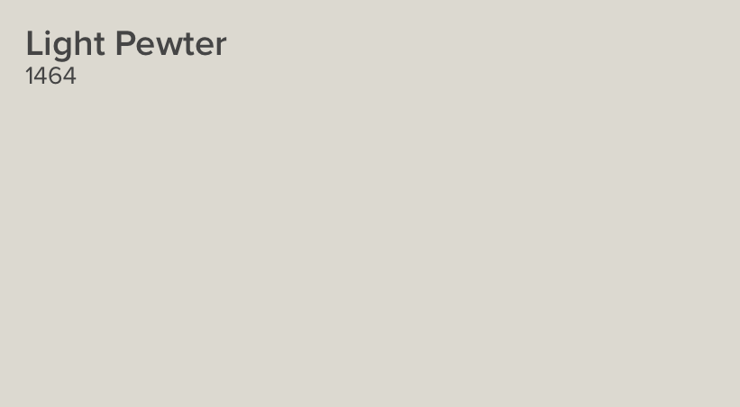
Light Pewter is a neutral that does the heavy lifting. As a multi-dimensional color, it changes tone in different lighting and serves as the perfect complement to almost any decor. It’s a great color for any room, and especially effective when refreshing your home to ready it for sale. We love it and think you will too.
All my best,
Claudia
PS: Here’s that beautiful blue wall I mentioned above. For this one, we used our favorite blue: Lucerne (AF530) by Benjamin Moore.